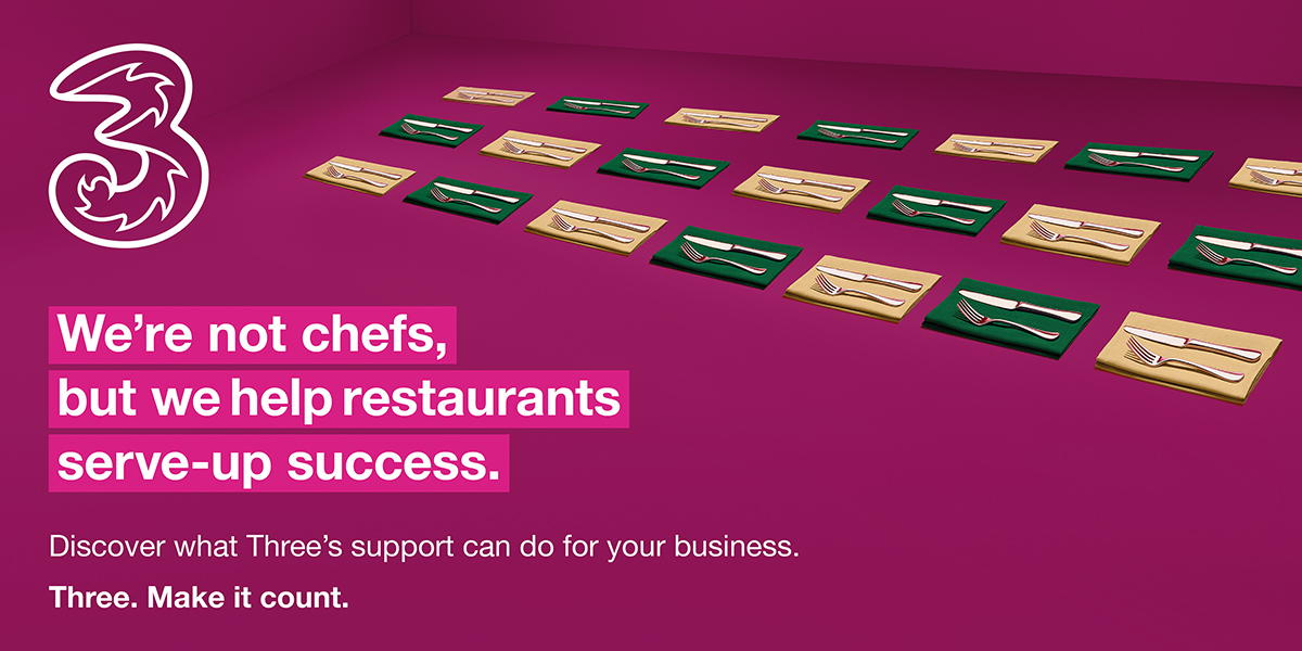
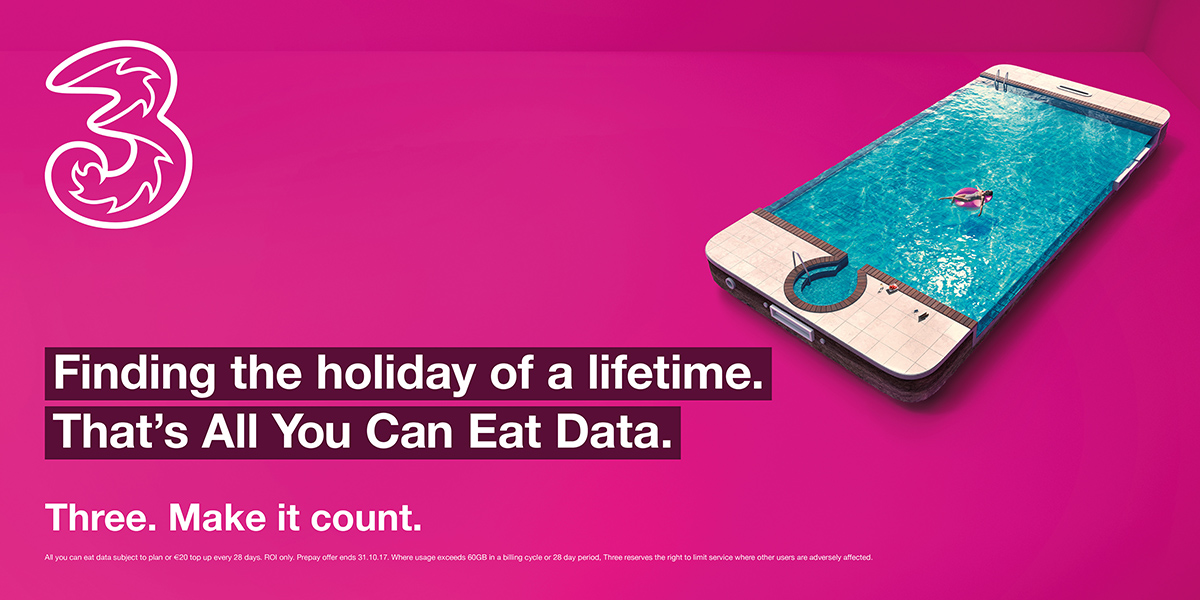
We’re delighted to unveil the work we’ve been doing on behalf of Three over the past number of months. The rebrand for Three is an evolution that moves the brand forward with a striking new visual identity and a compelling new positioning. We’ve literally been through the colour spectrum, absorbed international learnings and studied global brands that embraced the colour. And that’s why ultimately pink is the one that fits best with Three’s business and customer engagement objectives. We’ve been using it successfully as a highlight colour in the past 3 to 4 years. Now it becomes the predominant colour of the new brand visual identity.